
We were recently asked by the German publication, Patchwork Professional Magazin, to tell them which one of our quilts was our favorite and why. You’d think that would be a pretty easy exercise, but since there are two of us, we had to have a discussion. It turned out to be a fascinating exercise about our creative process. We thought you might benefit by doing something similar. Since most of you do not collaborate on your work, just grab a friend and play along. You can see how our session played out at the end of this post.
The Preparation
- Find an artist friend who is willing to do the exercise with you. They can work in a different medium.
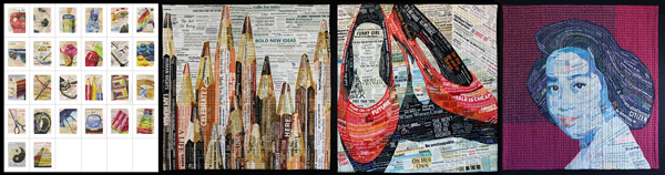
- Select 20-30 of what you think is your best work. (We don’t have a large body of work, so we just picked from all of our collage pieces.)
- Have the images available for viewing. You might use your smart phone or tablet computer.
- Have a paper list of your work available for scoring. (We just generated a list using our inventory software, GYST.)
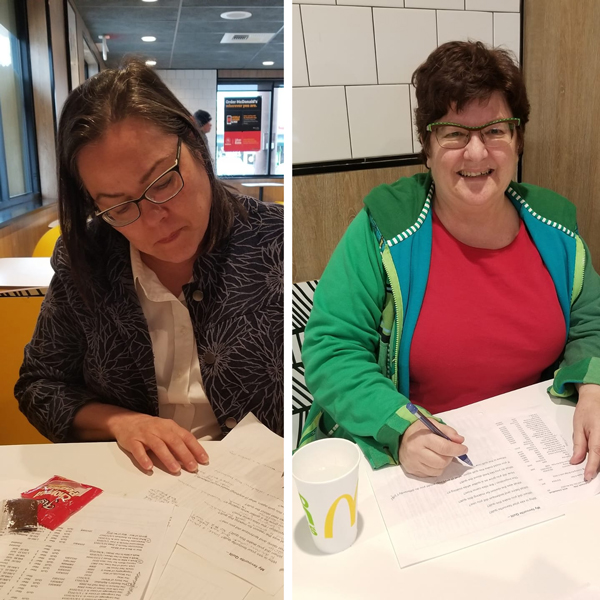
- Pick a neutral place to have your discussion. We highly recommend a gelato or ice cream parlour.
- Separately pick out your three favorite pieces and the three favorite of your friend’s artworks. Have them do the same.
The Reveal
- Explain why you picked your favorite pieces from your friend’s list.
- Be specific. Were your choices based on technique, composition, color, other aesthetic principles, or something else?
- Compare your list of favorites with theirs. Do you have any pieces in common?
- Have them articulate why they the chose their list.
- Do they understand your choices?
- Did you notice a change in their work after viewing these pieces? Have you noticed how your friend’s creative process has developed or changed over time?
- Now repeat the process for your own work.
The Pixeladies’ Session
We each picked our four favorite pieces. And wouldn’t you know it, we did not have one piece in common! That was pretty shocking to us. But, as we discussed our pieces, we started to understand that while we collaborated on the same pieces, we had different relationships to each of them.
Deb’s Favorites
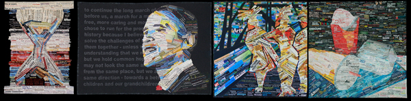
“It was more about the stories behind the quilts or the memories surrounding them,” Deb says. Just(ice) in Time really got us going on our collage quilts. The Picture is Only Half the Story was that incredible juxtaposition of our hopes and dreams (as collaged on Obama’s face) and Obama’s own words (the speech in the background). Deb’s always wanted to redo Crossing the Bridge with Faith. Neither one of us were ever completely satisfied with the background, but there’s such a great story behind this quilt. And the scale of American Still Life still impresses Deb.
Kris’s Favorites
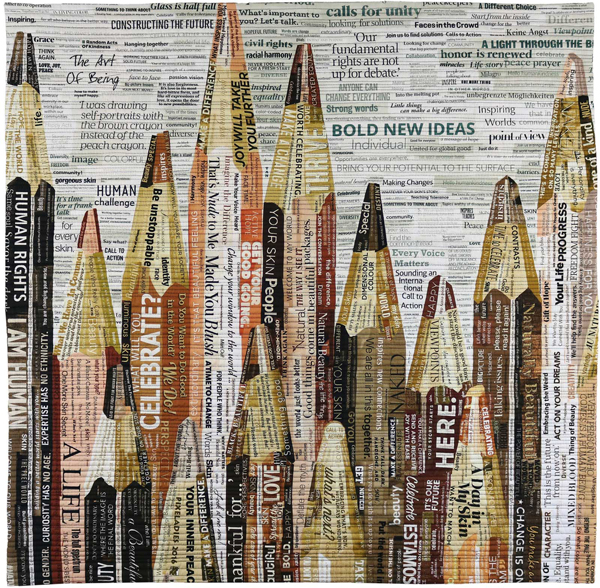
“It was one thing about each piece that has always stuck with me,” Kris says. The challenge of working small on The Reader’s Alphabet was the reason Kris picked that particular quilt. For The Language of Color 10: Drawing Humanity, it was the first time we had attempted to create a truly positive piece: human-like pencils all standing together regardless of their “skin” color. With Walk a Mile in Her Shoes: 78¢ on the Dollar, Kris worked on this quilt thinking we were going to elect our first woman US president. It was such a hopeful summer. And What Does an American Look Like is really the story of Kris’s immigrant family. For her, It’s one of the most personal pieces we’ve done.
Our Favorite?
For the magazine article, we decided to go with The Language of Color 10: Drawing Humanity. It was #2 on Kris’s list, and Deb’s reaction was, “I always forget about that quilt.” We made it for an exhibition and sold it right away. For all the ins and outs of why we decided on this quilt, well, you’ll just have to wait until the article comes out this summer!
What Lies Ahead?
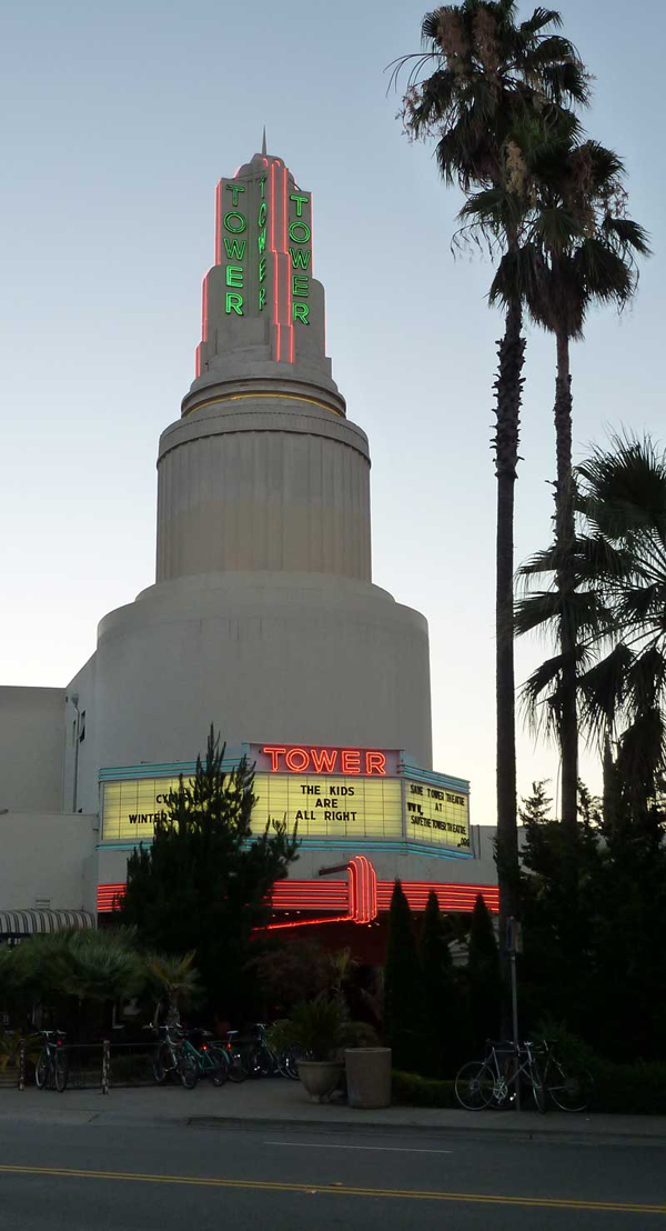
As we did this exercise, we were in the midst of planning out our next piece, an image of the top of the Tower Theatre in Sacramento, California. We’ve seen many a great film together in that old theater. So how did this exercise impact our creative process? Scale for one. We went bigger, close up, and then even bigger. We thought about our backgrounds. Same text collage or printed text backgrounds? We want that tower to stand out so we’re going to add related text to the background. And we thought about how we were at our technical best on the pencil quilt, stripping the original collage of color and then embedding our own. All interesting developments in our work process. Wish us luck. We’re trying to finish before a summer deadline!