
It’s Deb, back with the next episode of our project for the exhibition Deeds Not Words: Celebrating 100 Years of Women’s Suffrage. In Part 2, you may recall we decided to try something different and make our text collage in black and white and add the color in Photoshop. This post is about choosing the color for McCormick’s face.
Face Color in Art
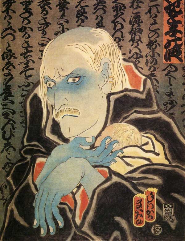
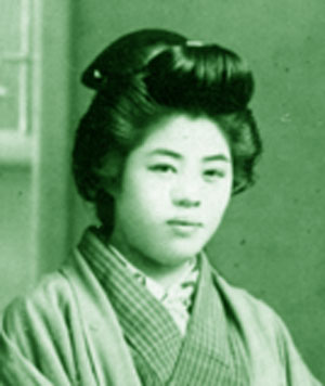
Colorizing faces is nothing new for us. For example, our portrait of Mitsuye Endo has a blue face. In Japanese art, blue or white faces are often used to signify a dying person or ghost. One of my favorite uses of blue faces is in Masami Teraoka’s AIDs series. In the image below right, you can tell the father is dying because of the blue.
Back when we first started Pixeladies, we were printing photographs on fabric, and we wanted to have some samples of what people could do to customize the photos. One way was to turn the photograph into a monochromatic image. We did a color study of Kris’ Bachan (grandmother) and came to the conclusion that when you printed faces in green, they tended to look seasick.
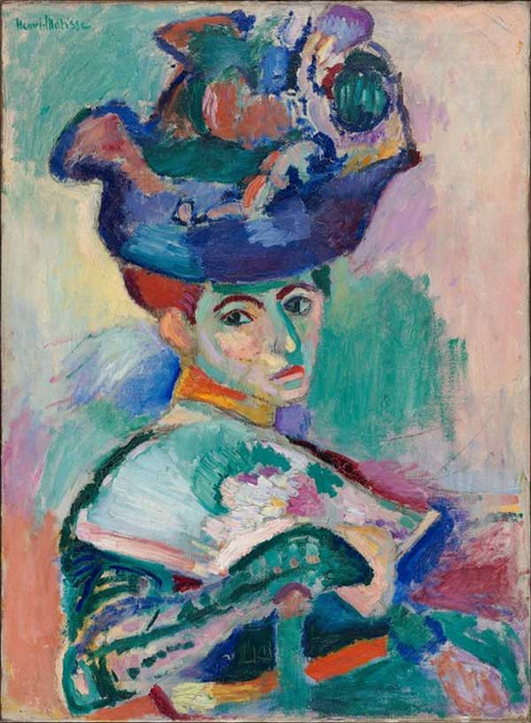
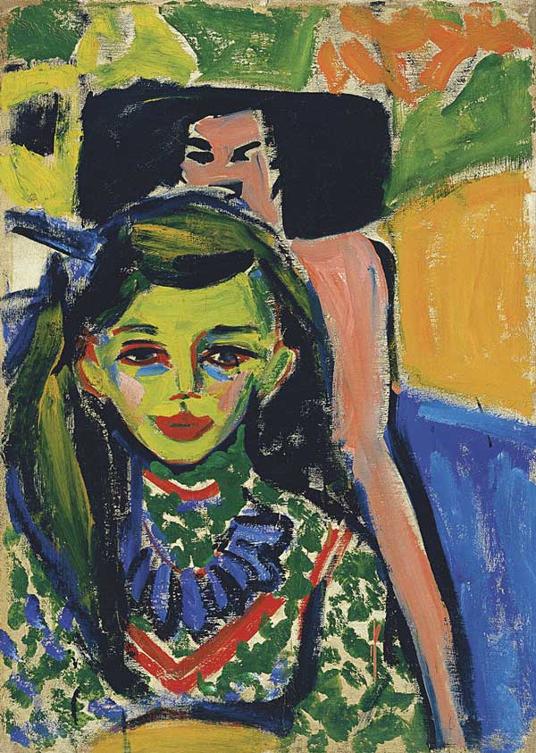
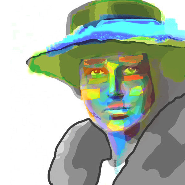
Nevertheless, when we first started talking about colorizing Katharine McCormick’s face, we both had the same image by Henri Matisse in our heads. And one of our favorite artists also painted green faces.
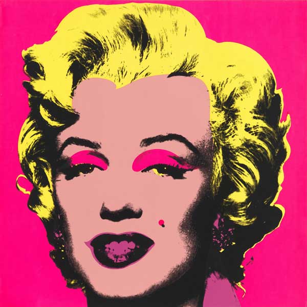
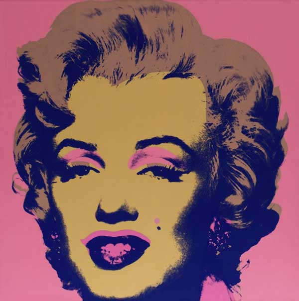
And you can’t think of strangely colored faces without thinking of Andy Warhol’s iconic portraits of Marilyn Monroe.
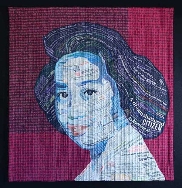
Colorizing Katharine McCormick
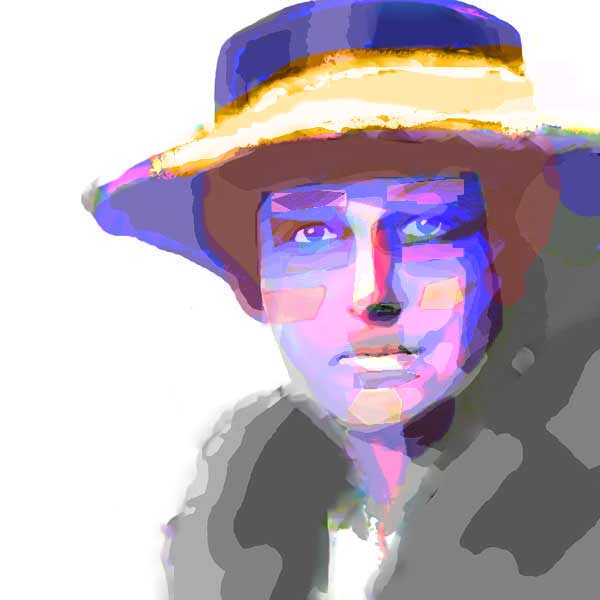
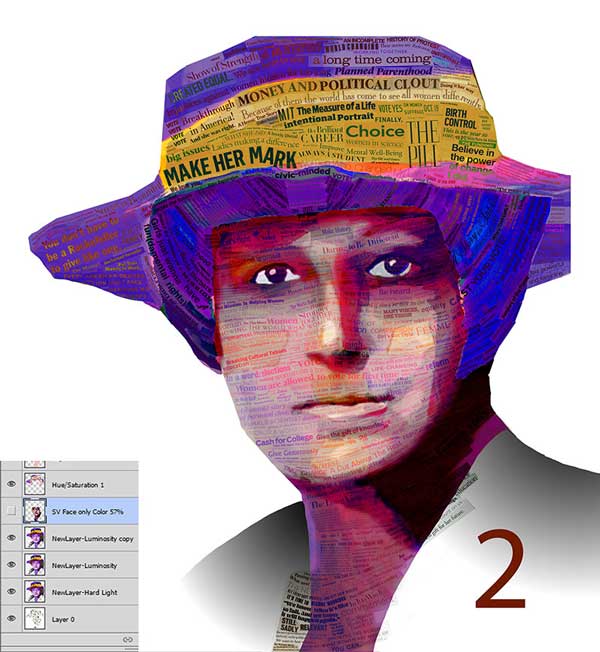
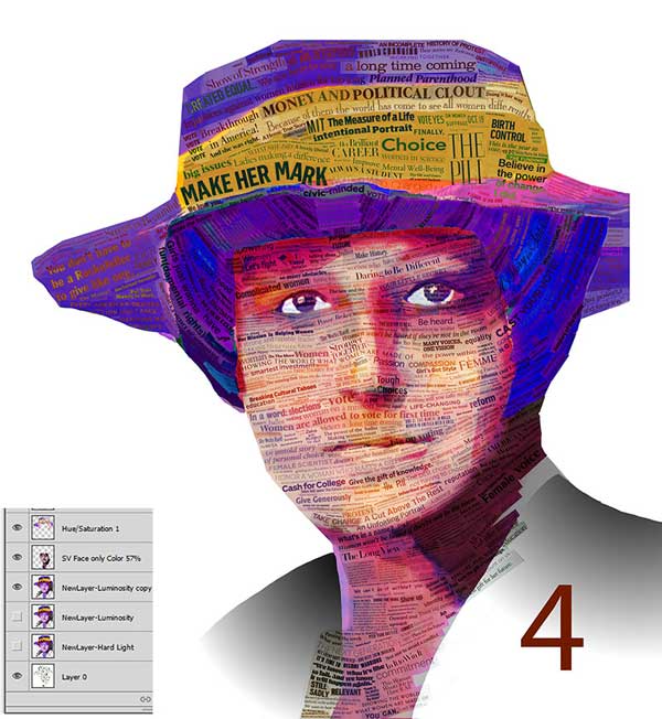
Not one to attract public attention, McCormick worked primarily behind the scenes. But her accomplishments were so amazing, we believed that underneath the quiet exterior lay an energetic, vibrant person. So we decided to make McCormick’s face as vivid as possible to symbolize her inner energy. My job was to create the initial digital drawing. At first I channeled the Fauvist painters to emulate their strong use of unconventional color over realistic hues.
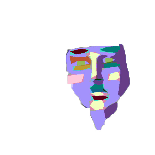
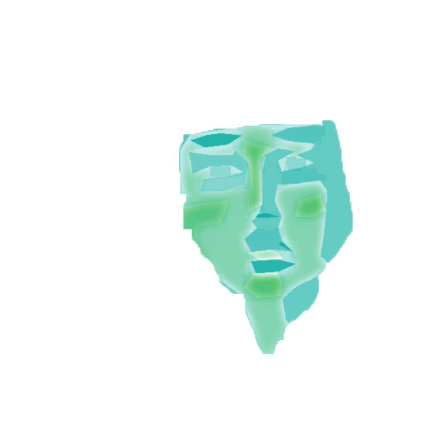
Then I superimposed the portrait of Katharine McCormick on the drawings and added some color to the hair and hat.
In the meantime, Kris continued with research and found that, in addition to white, purple and yellow were also significant colors in the suffragist movement. That information took us in a completely different direction. Purple and yellow are certainly vibrant colors, and what better way to portray McCormick’s energy than to add warm reds, pinks, and oranges?
Fine-tuning the Colors
Once we decided on the colors, we started to fine tune them. Because we’re not always working under the same roof, we send images back and forth via text messages and email. Here are some of the early options I sent Kris.

To get a feel of the subtle humor we try to add to our work, you might enjoy reading one of our email exchanges.
After that, it was time to sit at the computer, zoom in on the image, and start lightening, darkening, and changing the colors of individual text pieces. With this project, some of the contours we created with the text didn’t quite match the contours of the face. In the next episode, we’ll show you how we used Photoshop to change the placement and reshape some of the text.
4 responses to “Katharine McCormick: Choosing A Face Color”
Fascinating! Thanks for sharing.
Absolutely intriguing. Love your blogs!
You two do amazingly artistic things with words & color. Always an interesting study whatever you are working on. Thanks for sharing your talent.
[…] Not Words: The Power of Persistence, Celebrating 100 Years of Women’s Suffrage. In our last post about the project, we talked about how we chose the face color. This time we’ll show you how we gave Katharine […]