
This is Kris with a post about colors. Although the ongoing pandemic has definitely put a dent in the Pixeladies’ creative productivity, it has also allowed us some time to explore random topics that keep us inspired. One thing I’ve noticed recently is the incredible things some businesses have done . . . sure maybe to make money but in some cases also to simply make our world a better place. Today, it’s all about color. These two little bits of news reminded me of how much color has played an important part in our work but also in the storytelling we try to weave into each piece.
The Set-Up
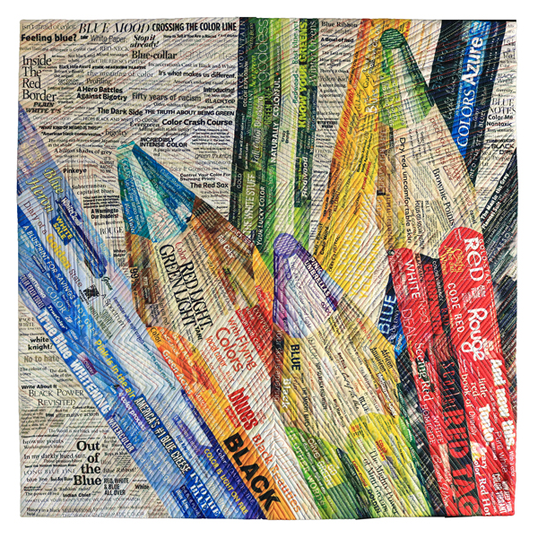
Our featured image above, The Language of Color 9: Color Dissonance, is evocative of the entire series. What looks like straightforward compositions of colored pencils turns out upon closer inspection to be quite stark discussions on race. “Color,” as it turns out, is a metaphor for our continuing discomfort of the harmful effects of racism on society. Click here to view other colored pencil compositions.
Crayola Crayons
Like many of you, I grew up coveting the 64-color box of Crayola crayons. And I remember using them all (except Goldenrod, never did like that color, reminded me of dog poop). How much I would have loved to have had a box of the new 24-color set called Colors of the World. Would have?! What am I thinking? I’m gonna own this pack – or better yet, the 32-color box that includes eye and hair colors.
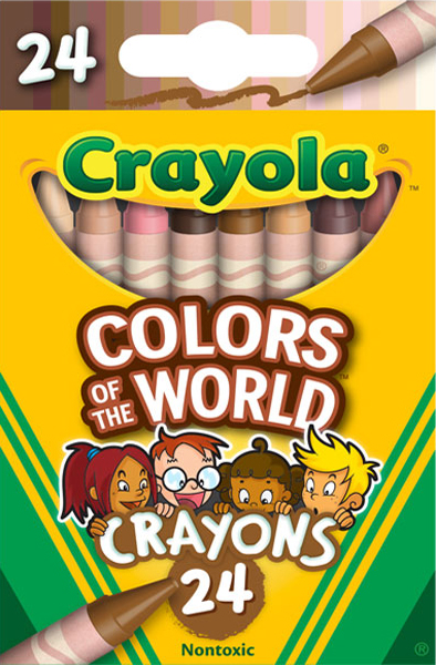
I don’t always recommend watching commercials or special ads, but watch this one. Who’d a thunk Crayola would have the foresight to engage make-up experts for this project. Good job, Crayola!
Pixeladies’ Colors of the World
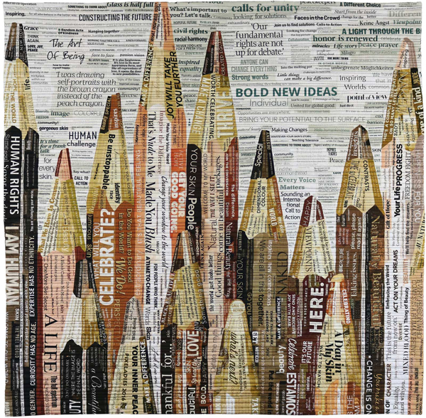
This special box of Crayola crayons reminds me of our Language of Color 10: Drawing Humanity. We worked hard on getting as many “flesh tones” as possible into the quilt. Click here to read our post about this special quilt. Why do we think this particular quilt is so special? We only wanted to include positive words and phrases about race, and that turned out to be quite a challenge!
Skittles
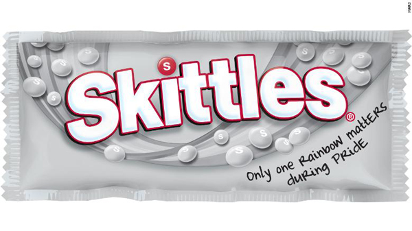
Many of you know that June is pride month, when people celebrate the LGBTQ community and its members’ accomplishments. In honor of pride month, Mars, Inc., is stripping out the colors of its popular Skittles, those little sickeningly sweet fruit-flavored candies. (Full disclosure here: if it’s not wrapped in chocolate, Kris doesn’t eat it, but promise Deb some combination of pure sugar and water, and she’ll pounce on it! One of the things Kris and Deb do NOT have in common.) I think this is pure marketing genius, and I don’t even eat the stuff. Perhaps the company will hear some smack about this, but even I want to buy a pack! (I’ll give it to Deb.) I’m not so naive to think these packs will be sold in every sales market, but I still give Mars great kudos.
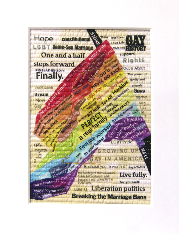
The Pixeladies’ Flag
Now you know how my mind wanders: Skittles – pride month – flag – oh, we’ve made a pride flag. We once created an entire alphabet for a client called The Reader’s Alphabet. When it came to the letter “F,” we quickly settled on the word “flag,” but which kind? We loved the great colors of the pride flag and what it means to the LGBTQ community to see it wave proudly. The piece is tiny, only 7″ X 5″, but it’s packed with some of our most powerful commentary on the subject. Happy Pride month to all our friends and family members who are part of this vibrant community!
4 responses to “We’re Showing Our True Colors”
Great post!
Thanks so much! It was fun to do the “research” for it.
Awesome post Kris! Wave on!
Thanks, Frankie.