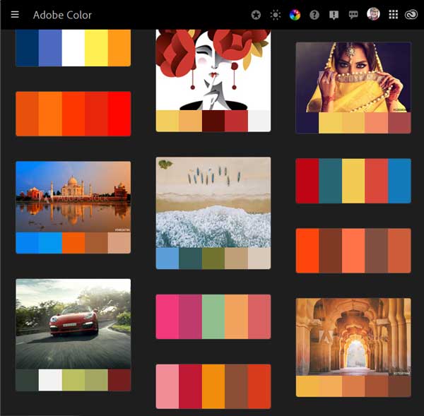

Has staying at home got you feeling kind of blue? Click over to Adobe Color for a change of scenery. Adobe Color is a website that lets you play with color. Have a great photograph that you want to use as the starting point for a postcard or brochure? Load it into Adobe Color and see what colors might complement the photo. Want to store some of your favorite color combinations so you’ll have a starting point for your next project? Adobe Color can do that. Want to easily use those colors in Photoshop? We’ll show you how.
How to Start
Visit https://color.adobe.com. The default landing page should look like a color wheel.
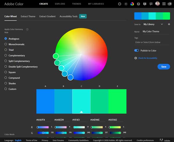
Adobe Color is fairly intuitive; you can move the dots around manually or click on one of the color harmonies on the left side of the screen (or from the drop-down menu if you’re using your phone). You can also use the sliders below the swatches to change a color. If you don’t like the dark background, just click on the sun icon on the navigation bar at the top of the page. Click on the moon icon to return to the dark background.
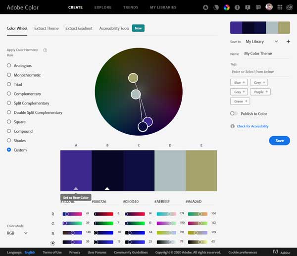
You can set one of the colors as the “base” color (see the purple box above) and then create a harmony around that choice. Don’t like analogous colors? Switch to split-complements. But wait, there’s more!
How to Extract a Theme
Do you have a photograph you want to use as inspiration? Click on the tab that says Extract a Theme, and drag the photo to the box or navigate to a location on your computer or phone.
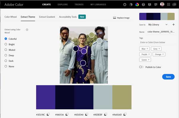
To adjust the colors, drag the dots to a different part of the image. You can also choose a base color and let Adobe Color create a harmony for you. Then modify those colors. The choices are unlimited.
How to Save the Colors
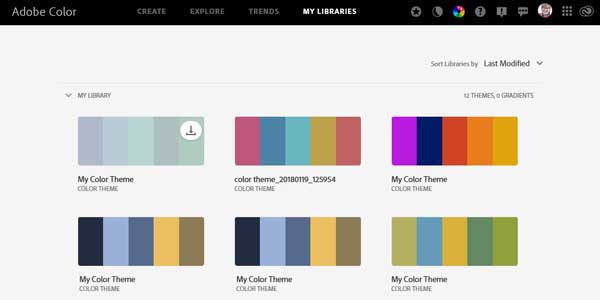
If you want to save your color themes, then you have to log in. If you have registered an Adobe product, you can just log in with the same credentials. Log in with your Google, Facebook, or Apple account, too. Adobe Color saves your color swatches in libraries. Below is an example of one of my libraries. To see what’s in your library, just click on the My Libraries tab at the top of the screen.
Once you save your theme, you have even more options. Click on a swatch set and it will appear in a new window
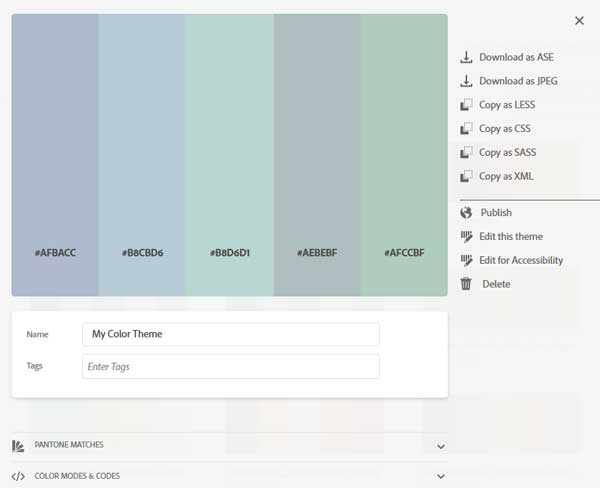
From this menu you can rename the set, edit it, publish it for the whole world to see, and even check to see how it would work for someone who’s colorblind.
How to Create Swatch Sets for Photoshop
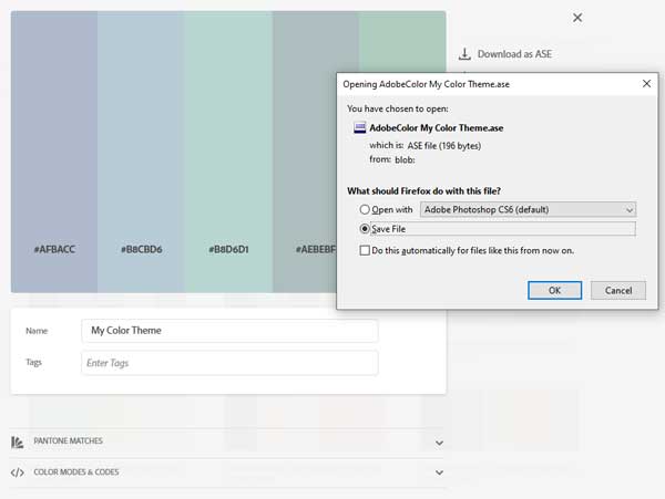
My favorite part of this website is how Adobe Color works with other Adobe products, like Photoshop and Photoshop Elements (PSE). So, let’s say you’ve created a set of colors that would be perfect for a postcard advertising your latest exhibition, and you want to use those colors in PSE. You don’t have to jot down the hex codes or RGB formulas, you can just download the swatch set to your computer and upload it to PSE. First click on the top choice: Download as ASE. When the dialog box opens, choose Save File. Next give the file a name, choose a location you will remember (I have a folder called PhotoshopColorSwatches), and click OK.
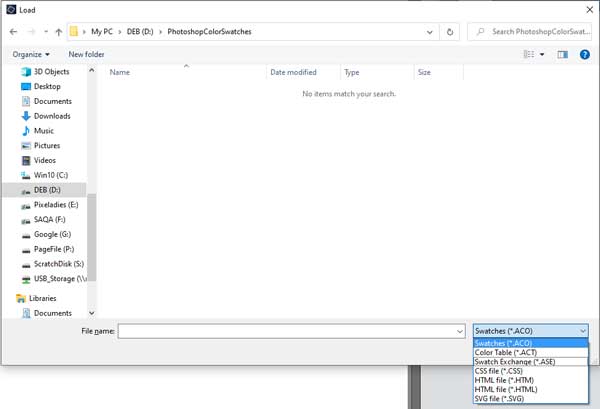
How to Load the Swatch Set
To use your swatch sets in Photoshop or Photoshop Elements, open the program and then open your color swatches panel (Window > Color Swatches). Then Click on the menu icon and choose Load Swatches.
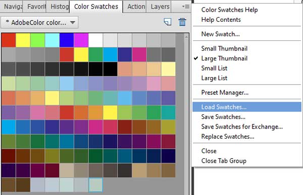
Navigate to the folder in which you saved the ASE file. If you don’t see any files, be sure to check that the file type is set to .ASE. Then click Load.
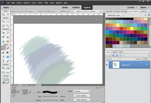
That will put your new swatch set at the bottom of all the colors. If you choose Replace Swatches, all the other colors will disappear and only your new colors will show in the dialog box. It’s easy to just click on one of the swatches to paint with those uplifting new colors. In my case, it’s colors to make me feel cool on these hot, smoky days in California.
Stay Tuned
There are so many other cool things in Adobe Color, so explore the site or come back next week for more tips. We hope that Adobe Color brightens your spirits a little bit.
4 responses to “Lift Your Mood With Adobe Color”
[…] showed you how to create color swatches from a photograph using Adobe Color. You can read that post here. Today I’ll show you how I used the same photo to create a color […]
I am a photographer and artist. I always have to work with color. I hope your informative post will be very useful to me. I hope a lot of ideas can be taken from Adop Color in the case of color combinations and create new colors. Thank you so much for your informative post.
[…] blogged a bit about color, most recently on how to create color palettes using Adobe Color. Click here to read about that. You might also enjoy our post about colors, crayons, and Skittles. My question […]
I must say that choosing the right color schemes for websites has always been a struggle for me as a user. I always know where to put the elements, what will look good and how to structure the page. I rely a lot on existing branded material and logos for a guide to website color, but there are some really good tools here. One of the most useful and powerful of these tools is Adobe Color, a web application created with designers in mind.